Metrics Explained: Realized Market Capitalization Hodl Waves
Very simple. Instead of multiplying the supply x current price , which would be the regular market capitalization, multiply each token by the price at which it
非财务建议。DYOR。
Read full report
My first question, what the hell is "realized market capitalization"?
Very simple. Instead of multiplying the supply x current price , which would be the regular market capitalization, multiply each token by the price at which it last moved on-chain , which looks something like this but way more detailed, let's use BTC and a bunch of made up numbers as an example:
Assume 21,000,000 supply
Regular Market Cap
21m x 91,000 = 1.9 Trillion
versus
Realized Market Cap
4m x 1,000 + 7m x 30,000 + 7m x 60,000 + 2m x 90,000 + 1m 100,000
4B + 210B + 420B + 180B + 100B = 914 Billion
What does this figure accomplish? What does it mean? Think of it like an alternative "market cap" that's that's weighted by holder behavior and historical cost basis rather than just the spot price. Most movements come from trades, but some are non-trade transfers (gifts, internal wallet moves, etc.), so there's a bit of noise. Still, it ties together the historic purchase prices of coins with their current economic weight.
The more long time holders from low prices exist, the lower the realized market cap. If there's more activity at higher prices then the realized market cap is higher and closer to the regular market cap. If there is a small or large difference in market cap and realized market cap, that should give you some hint about the aggregate positions of all holders.
Rules of thumb:
- If old coins bought low are sold, number moves up more sharply.
- If coins bought high are sold low, number moves down (can't happen during ATHs).
- Since transactions are always happening there is always a force pushing the figure towards the regular market cap. Eg., the current BTC price of 90,000 updates all of today's transacted tokens. If moved today, low priced coins or higher priced coins get placed in the 90k tier, which brings the realized market cap closer to the regular market cap.
Key questions to ask:
- how different are the two numbers and why?
- how quickly is the realized cap converging on the market cap and why?
Next question, what is a "hodl wave"?
A hodl wave is a grouped set of held tokens acquired as a certain time interval. For example, tokens acquired in the last month would be one set of hodl waves, while tokens acquired 7d - 30ds ago are yet another set of waves. You can segment the waves however you like, the essential idea is that coins/tokens with similar "age" are grouped together. Age distribution is somewhat synonymous to "hodl waves."
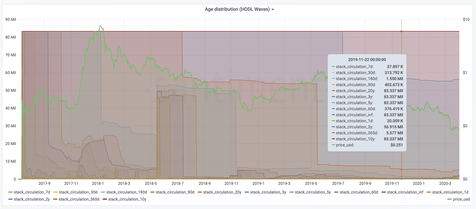
So if you were to sort all actively circulating coins into age buckets, like: Coins moved in the past week, Coins moved in the last 1–4 weeks, over 1 month ago, over 1 year ago, etc... HODL Waves show what percentage of circulating supply falls into each of those age groups.
If you look up Realized Market Cap HODL Waves in the Sanbase Charts you will notice that they are separated by time intervals, aka coin age (0 - 7d, 7 - 30d, 30 - 60d, etc...)
Final question, how do hodl waves and the realized market cap go together?
They go together in that Instead of just showing supply percentage by age, they show the economic weight (realized value) of each age interval as a percentage of the total realized market cap.
Here's an example: realized_cap_hodl_waves_1d_to_7d is computed by dividing the realized cap of coins that are 1 to 7 days old with total realized market cap: (realized_cap_usd_7d - realized_cap_usd_1d) / realized_cap_usd
eg., (30,000 BTC x $90,000 = 2.7B) / (1.09T) = ~0.002477064
scaled as a % between 0 and 100, this would show up as 2.4%
The resulting number is a ratio of that period's (value of tokens purchased) / (entire realized market cap). What does this number tell us? It tells you: "What portion of the entire realized market cap was 'purchased' (or last transacted) in the last 1–7 days?" In other words, it's a price-weighted view of short-term trading activity within that window. Spikes in a short-term band (like 1d–7d) often signal heavy recent buying or selling at current prices. You can see this in BTC's 1d–7d Realized Cap HODL Wave chart—e.g., a big upward move in late November reflected strong net accumulation by short-term participants, a hodl wave.

Bonus: how is this metric different than just simple volume?
Volume just counts total value of all the transactions in a given period. Realized Cap HODL Waves filter to show only the economic significance of trades within a specific holding period. In the example above, all the trades of BTC held outside of the specified time interval are excluded, so you can see what the 1d - 7d short term holders did.
Bonus: How do I make use of this metric?
- Compare behavior across bands: short-term traders vs. medium-term vs. long-term holders
- Spot shifts in sentiment: Are short-term bands spiking during euphoria (possible top signal)? Are long-term bands growing during fear (accumulation)?
- Track convergence/divergence between bands to gauge whether momentum is broad-based or concentrated among certain holder classes.
This metric gives deeper insight into who is driving price action and how committed different holder cohorts are. Let me know what you think—or if I butchered anything! Happy to iterate.
非财务建议。DYOR。